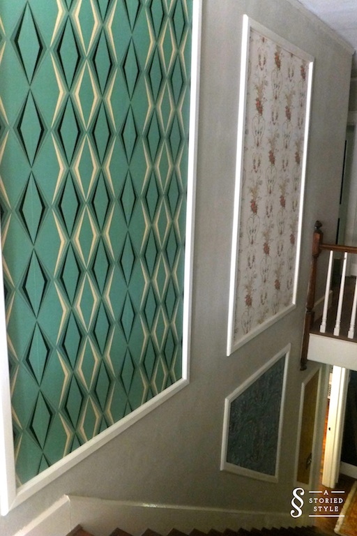
30 Oct My Wallpaper Panels
My long awaited wallpaper panels…my husband and I dreamed up this project nine months ago. We had a boring staircase area we wanted to liven up, and after tossing several ideas around, we arrived at using different wallpapers to create visual interest. As you can imagine, choosing the wallpapers was the most difficult part. Picking designs I simply liked didn’t feel right to me, I wanted them to have more meaning than that.
Since we live in a historic 1921 home, we wanted to be cognizant of the home’s integrity. That time period is interesting design-wise because there were many flavors in the pot (a little Victorian, a little Federal, heavy Chinoiserie influence), and the Art Deco period was emerging. I searched extensively for true 1920’s wallpaper, but the search was fairly fruitless and what I was finding was $$$. I read and read and read, and after finding this 1925 wallpaper book on Ebay, I felt fairly confident in beginning the wallpaper choices.
Our trusty handyman created custom moldings based on the original 1921 moldings we have in our home. After several months of waiting, designing, a little agonizing over pattern, and countless wallpaper samples, here is our finished project.
Let’s enter at the bottom of the staircase, shall we? The mustard color wallpaper is from one of my favorite vintage and antique wallpaper sellers found here. I have bought from him for years, and his knowledge and customer service is excellent.
The intricacy of this chinoiserie wallpaper is really beautiful. Found here.
It’s difficult to say which is my favorite, but I do love the Victorian feel of this one. Found here. A “new to me” seller I also highly recommend!
I do love this mint color, too! One of two panels I dedicated to the Art Deco emergence of the 1920’s. Found here. 
These two panels are directly across from the panels above.
Floral wallpaper found here.
Metallic Art Deco teal wallpaper found here.
The finished product makes me so happy. Isn’t it wonderful when you see a vision come to life? I feel we accomplished all of our goals in that the space is bright and happy, and it connects with the rest of the home. Since our staircase is so spacious, it is a large element of the house, and it is so interesting to look at now. It is almost like an art gallery wall with the intricacies and variations of the patterns. Being sophisticated and refined doesn’t have to mean cold and stuffy – I feel the panels bring some warmth and coziness to the previous gray expanse. Of course, if I ever get tired of the patterns, I can change them out fairly easily. Probably my favorite thing about them overall is they look like they belong, like they have always been there. Doing the different papers was a bit of a design risk, but I definitely think it paid off. It is beautiful, and it is feeling more and more like home around here.
What do you think? Where could you use this idea in your home?


Papa Buck
Posted at 07:41h, 30 OctoberThis looks really good Gracie. Only you could pull this off.
Grace
Posted at 09:47h, 31 OctoberThanks Papa Buck! I know how you love my eclectic-ness.